They always say that practice makes perfect, and this stands true in every aspect of life, whether in school or in your household. You have to do something repetitively in order to get it right. Professional graphic designers are no exception to this maxim.
At first glance, web design is really tricky to master because a ton of visual elements are incorporated. You must also consider the user experience (UX)—the message you want to get across and the emotions you want to elicit. This is why most professionals tend to commit these generally unnoticeable mistakes:
- Overcrowding
Sure enough, professional designers are fond of impressing their clients with too many visual components. Busy designs with different texts, images, and templates might simply discourage users from visiting your website. Try to organize everything into categories. You can place a photo or an article as the highlight of your main section. Additionally, insert the contact details of your organization at the bottom of the page for ease of communication.
- Inconsistency
Designers must ensure that the fonts, formats, and color palettes they use are uniform and consistent throughout the website. Without coherence, there is a chance of consumers getting confused about the organization’s overall identity. It is only right to maintain a proper discussion of visual goals between the client and the designer. You may choose three for the primary and accent colors. The typefaces should also be complementing each other.
- Unsuitable graphics
Photos are essential in developing an engaging webpage since these amplify the texts involved. There are a number of professionals who miss out on sizing an image to the correct resolution. As a result, the contents might be pixelated or blurred. You must guarantee that these are of high quality, which may ultimately reflect the values of your business/company.
- Complicated navigation
Have you ever been to a website where you cannot find the search bar or the home page? This is due to poor design choices. Not being able to include a systematic menu of your content can induce a decrease in your audience. Certainly, good navigation equates to happy customers.
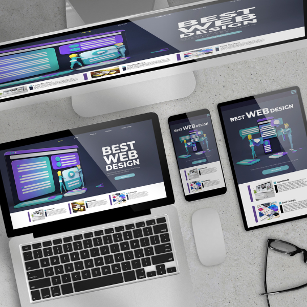
- Failure to take account of mobile view
The world’s transition to a mobile-centered media environment means that graphic designers should factor in how users view a website through their phones. While desktop computers are the primary device for designing, mobile phones have become the number one tool for users who consume content on the Internet daily.
No more messy and confusing website designs with Dezynspace
Need help with generating the most visually appealing web design for your business? Do not fret, our professional graphic designers are always available for your needs. They are vetted and meticulously trained to respond to any design problem.
Dezynspace is an online platform where you can meet professional designers who will help achieve your goal. Our company trains design talents in order to make them comfortable with using emerging technologies, as well as attending to client’s needs efficiently.